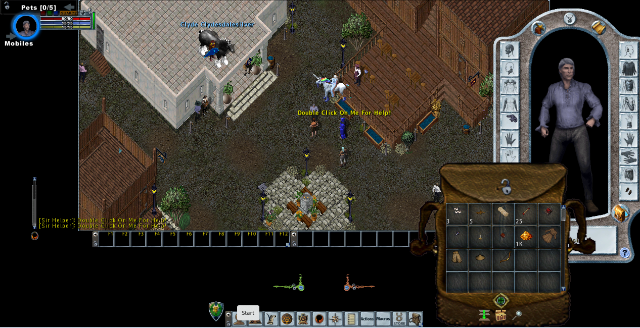
The default layout of the EC is horrifying and probably chasing people away.

So yeah I happened to install and fire up the EC the other day and what the hell is this crap? What were they thinking?
"Yeah let's put the gameplay in a little window in the center, but still make the chat window awkwardly overlap it. We want the screen to be like 45% dead black space at a minimum. That'll save us lots of room to put two tiny red and green buff brackets. Also make the text borderline unreadable."
Bro @Kyronix dude there is no way this isn't having an outsized impact on F2P newbie churn. I know you've heard all the "we moved a tutorial door five feet to the right and retention went up 10%" game developer stories. This has to be hurting you. If I came in fresh and saw this and wasn't already financially invested I'd just close it out and go play something else.
Seriously just move shit around until it looks like something someone might play on purpose and then save that config as the default. This should take basically no time at all.

Comments
I barely ever use EC and to this day I don't know how to log out of EC without just clicking the "X" in the top right lol. In CC they dummy-proofed it for me; there is literally a button that says "Log out".
Never be afraid to challenge the status quo
Never be afraid to challenge the status quo
Never be afraid to challenge the status quo
I do agree that it could perhaps be better, starting with things like the backpack/containers having a brighter background. It’s there in the settings but still.
As for logging out of the EC, I just hit the ESCAPE key and it brings up a menu with logout, exit game, user settings, Macros, Actions, Ultima Store, Help. Etc.
Is it perfect? No, but for players coming in from other MMOs, it’s going to be the one they gravitate towards.
Other MMOs absolutely do not turn 40% of the screen into dead space so they can make room to hold two tiny icons and stupid shit like that. Whoever approved this layout should be ashamed of themselves. So tired of these "actually trash tastes good to me yum yum" UO forum Stockholm Syndrome posts.
With that said, we are getting resizable windows in the CC later this summer/fall.