A question about EC settings, please
TanagerTanager Posts: 634
edited November 2019 in General Discussions


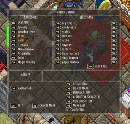
This see-thru business started today. I didn't change any settings, so I don't know how it happened but I have a REALLY hard time reading this. How can I change this back to a solid background?

Thanks.

EDIT: Just read patch notes...

*Resolved issue where gump transparency did not function properly in the EC

This needs a setting so it can be turned OFF, please. White on grey has always been an issue for me, but white on hazy grey with lots of random other colors under that will drive me insane.

Comments

  • PawainPawain Posts: 9,630
    They changed the menu to CC.  Did EC look the same but solid before?
    Focus on what you can do, not what you can't.
  • DJAdDJAd Posts: 290
    Yeah please turn it back to the more solid view. Also why does the EC vendor search look the same as the CC one?
  • DJAdDJAd Posts: 290
    Also if we are going to have the CC vendor search gump in the EC please can you make the text black or something easier to read? White is HORRIBLE. See my example below.

    I have added the black "20" into lower reagent cost. Faster cast recovery and faster casting are filled in with the current white text and its almost impossible to see.


  • TanagerTanager Posts: 634
    Is that what CC vendor search looks like? I can adapt, I suppose... if it fixes the issues VS has been having.

    CC has always had transparent craft gumps? I can read the transparent gump, but I do a LOT of BODs and crafting, and the transparency on both is really hard on my eyes after a while. I suppose I can create a HUGE black wasted space for the craft and BOD window...

    An option in settings would be a lot nicer tho! @Kyronix


    Begging
       
  • TanagerTanager Posts: 634
    Is this what the taming mastery looks like in CC? (Sorry, I don't feel like patching up CC atm). I can barely read that... and only because I already know what it says.


  • DJAdDJAd Posts: 290
    Tanager said:
    Is that what CC vendor search looks like? I can adapt, I suppose... if it fixes the issues VS has been having.
    Yeah I don't mind as long as it works but it is still giving me "too vague".
  • PawainPawain Posts: 9,630
    edited November 2019
    Yup. All of those are CC menus.  They changed the EC ones to CC it seems.

    The difference is, we have a black space on the side that we can put the menu in front of.
    EC uses the real estate.

    Look at the char transfer menu.  CC is clear. Did they also change that one in EC?
    Focus on what you can do, not what you can't.
  • KirthagKirthag Posts: 541
    personally, with the way the UI is for EC and CC, I don't think the necessity for having "transparent" gump backgrounds is necessary anymore. 
    Make it solid, with higher contrast for readability.

    UO has never met any ADA requirements for visibility... not that many games do. But I know for a fact many of them take ADA into consideration when doing key design stuff for HUD display and UI overlays.

    Since we didn't "ask" for any fixes to the gumps, maybe the devs could just use a preexisting template and do an entire HUD/UI design rework in the next year? *hint*
  • Tanager said:
    Is this what the taming mastery looks like in CC? (Sorry, I don't feel like patching up CC atm). I can barely read that... and only because I already know what it says.


    A Goblin, a Gargoyle, and a Drow walk into a bar . . .

    Never be afraid to challenge the status quo

  • PawainPawain Posts: 9,630
    edited November 2019
    The crafting gump stays where you move it so you can put it in a better spot to see it. As above.

    So, EC gumps were causing all the lag?  We could have left the Bamboo mats alone?
    Focus on what you can do, not what you can't.
  • ActionEllyActionElly Posts: 163
    edited November 2019
    I was just about to post about this. I noticed the change after I patched, I really hope they either change this back or give an option. The vendor search doesn't bother me so much as everything else.

    They may have changed this to make the EC transparency work for the mannequin.


  • MissEMissE Posts: 782
    I dont have anywhere on my 15" laptop screen to move these vague gumps onto a darker area to be able to read them, change them back or give us a toggle for transparency please.

    Cheers MissE

    For more info about Angelwood Warehouse Events go to the A.W.E Forum
  • Petra_FydePetra_Fyde Posts: 1,426
    I'm not totally sure that's intended. The publish note refers to the mannequin interface, where transparent is an option that can be selected. 
  • TanagerTanager Posts: 634
     When I posted this originally, I thought it was just an EC setting that somehow got flagged on and that I could change. However, it seems evident that it has to do with the current patch on testing. This is being discussed in the Publish 107 thread in the TC forum, and seems more appropriate there.

    https://forum.uo.com/discussion/5323/publish-107-jolly-roger-release-3#latest
  • PincoPinco Posts: 22
    DJAd said:
    Also if we are going to have the CC vendor search gump in the EC please can you make the text black or something easier to read? White is HORRIBLE. See my example below.

    I have added the black "20" into lower reagent cost. Faster cast recovery and faster casting are filled in with the current white text and its almost impossible to see.


    I checked the default scripts and they turned off the vendor search window to re-enable that monstrosity...

    Also all the other transparent gumps cause problems because they didn't fix the font, lucky for who is using my UI that I changed the gumps font not long ago and is far more readable than the default one :smiley:
  • PincoPinco Posts: 22
    I digged a little deeper, and found out that this is what's beneath a gump (like crafting gump):


    that big stone part are the "borders", while this:


    is the part that makes the "background".

    Now on cc the "background" woks as a mask, cutting the borders and leaving them dull while the bg is nice and good.
    On EC we don't have masks so we get all dull or all transparent like the did... if they add a mask capable of doing what CC does, the result would be MUCH better...
  • PawainPawain Posts: 9,630
    edited November 2019
    Yes, the white letters make it easier to read in CC.  


    This is why we have been using it just fine.
    The CC vendor search is also easier to read than the example above.
    temp.png 226.8K
    Focus on what you can do, not what you can't.
  • HomerHomer Posts: 32
    edited November 2019
    If your going to change something like this, at least make sure looks  right before pushing  it out on everyone, now i have to spend my my time  fixing this mess with  kludges and work arounds so i can read anything on the screen for every gump that i need to fix, because it's transparent to read.


    Before Shots


    After Shots, crafting menu  bottom is part Pinco's UI that i still have to do


    these after shots dont even have same lvl of darkess between the gumps when they should, but im guessing that  the alpha kludge im using  and the diffrent backgounds used on the gumps, i end up with this
    1.png 411.9K
    3.png 669.7K
    2.png 357.2K
    4.png 596.4K
  • PincoPinco Posts: 22
    in the end this is how I fixed the problem (available on the next UI patch):


    I think it's the closest I can get to cc style in every gump :smile:
  • PincoPinco Posts: 22
    edited November 2019
    lol now they removed the transparency and the mannequin gump option for it is completely broken -.-

    anyway who uses my UI will have the correct transparency in all gumps and the mannequin gump is permanently transparent...
  • Lets pretend it just never happened  :D LOL
    Just a troll who got told by lesser trolls (moderator classification)
Sign In or Register to comment.