New SoS Decorative Chest Issue
in Test Center
I love the new chests.....
except...
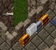
their placement is off in relation to all other chests in game, which means it's hard to use both models in conjunction with each other.
The one ones placement is more against the wall vs in front of the wall.
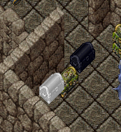
The issue isn't as pronounced in the other direction, but still there
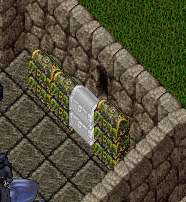
Also, if you look back to the gold chest pictures, there is a line in the gold

There is also a glitch in the artwork for the gold/silver chest a pixel wide slice runs through it.
except...

their placement is off in relation to all other chests in game, which means it's hard to use both models in conjunction with each other.
The one ones placement is more against the wall vs in front of the wall.

The issue isn't as pronounced in the other direction, but still there

Also, if you look back to the gold chest pictures, there is a line in the gold

There is also a glitch in the artwork for the gold/silver chest a pixel wide slice runs through it.

Comments
Yeah it's like they sit IN the wall instead of next to it.
It's on the new silver ones as well.
Someone pm'd me to tell me the old chests used to sit where the new ones do.
I guess it's a matter of which aesthetics you enjoy more.
(could spend 20 minutes pointing out the minuet differences and pros and cons of each way)
It would just be nice if all chests could be lined up with each other.
Yea please!
Yes, for the love of all things holy, change the old chests to sit like the new ones!
Having the chests sit on the tile is the way it's supposed to be!
The chest overlapping the tile, or sitting on the line between tiles, has driven me crazy since the EC came out.