Creativity with Non-Traditional Style Structures
So
many people gravitated towards designs that reflected what we already
have. Personally I was hoping to see more variety other than what constitutes a standard Western European castle or keep. No
one said we had to create a European castle or keep. That being said, I am amazed at the creativity of what people came up with.
We've
got a huge space to work with and this was/is an opportunity to create
something totally different. I thought it would be a good thing to start
a thread about non-traditional building styles so maybe others can
start thinking of design work now to get ready for the next one.
Just
to share a bit, post the ones that you liked, regardless of the
imperfections, the details that you didn't think fit, but that
overall design you liked. Please don't post your own work. Let's be positive
about someone Else's work.
The purpose of this thread isn't to argue opinions of good/bad design. It's just to respectfully share what we thought was different or special to get some creative juices flowing.
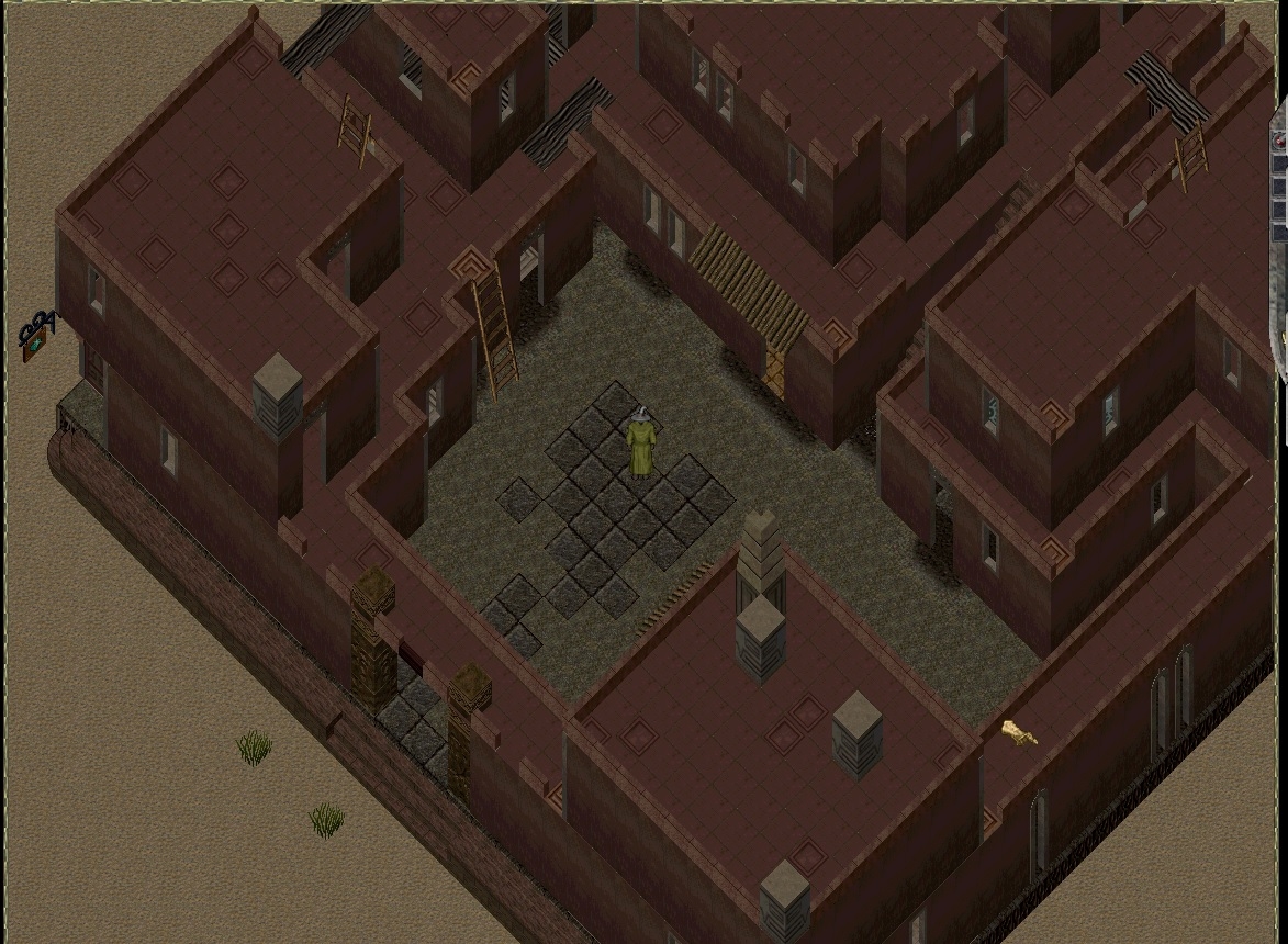
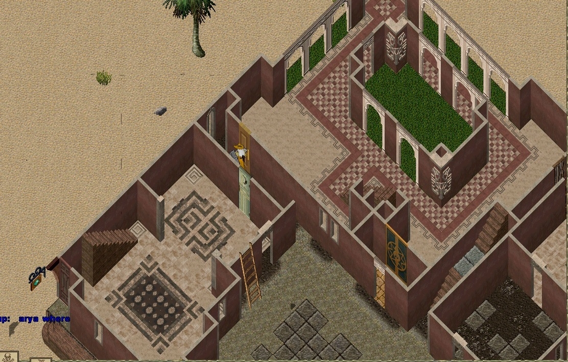
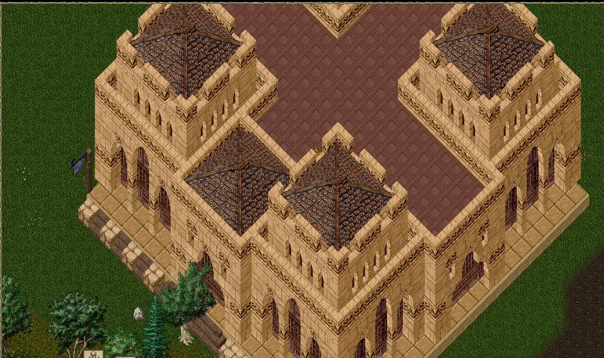
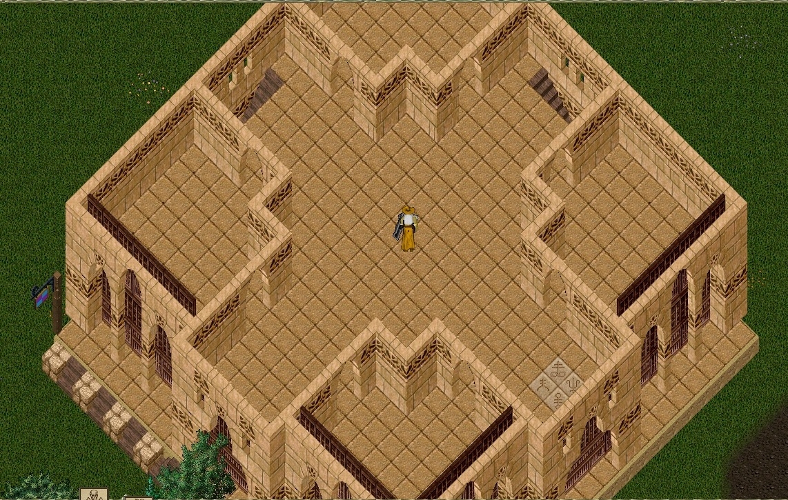
I'll start with 2:
Scenes of Morocco


Sandstone Keep


Comments
I quite like both of those. There is also a Japanese style compound that I thought was a nice change along with a couple of castles that were off-set to the plot (and Finley's little village). The thematic designs really showed alternate aspects of what UO housing can be.
Second one, the corner rooms are too small. A harpsichord and related items would not fit. Too small for a bedroom with dressers. Too small for a Kitchen or crafting room.
We like what we like. Doesn't the whining tell you this?
The first one could have gotten the same external look without dividing up the interior into separate houses and small rooms.
The second one I have to ask why the 4 rooms? The centre could be used for a large crafting aria but only with difficulty and by taking up the centre of the house. With a bit of creativity internal wall can be added one way or another if the "homeowner" wishes.
Of the two I prefer the outside look of the first one.
People totally missed the point of this thread, it wasn't to pick apart the two Amber showed. The purpose was to show designs you liked and critique it (critiquing doesn't have to be negative). If I can find the ones I liked in the resorted list I'll post screen shots tomorrow.
I would have loved more feedback on my design and I would have loved to have been able to give it to others before our designs were committed for voting.
The point of my reply is; No matter what designs are chosen, you will not satisfy everyone. We are very picky with our homes.
Notice how none of the complaining posters say a specific # is better than the winners. The designs in their heads are better.
Where can I set up all my crafting stations
Where can I set up displays
Where can I have gatherings
Where can I place Vendors
Where can I place storage containers
Nobody wants to put these things into a bunch of small rooms or a poor designed floor plan.